
Le Chat en HTML / CSS par Gemini
Comment créer un chat animé uniquement avec du code ? Découvrez le défi relevé par Gemini : un chat espiègle en pur HTML/CSS, sans images.
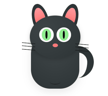
J'ai demandé a Gemini de Google de me dessiner un chat en html/css avec une petite animation de ses moustaches. Voila ce que cela donne (en bonus Google lui fait bouger la queue).
Autre exemple: Voir la carte de France du Chineur
 |
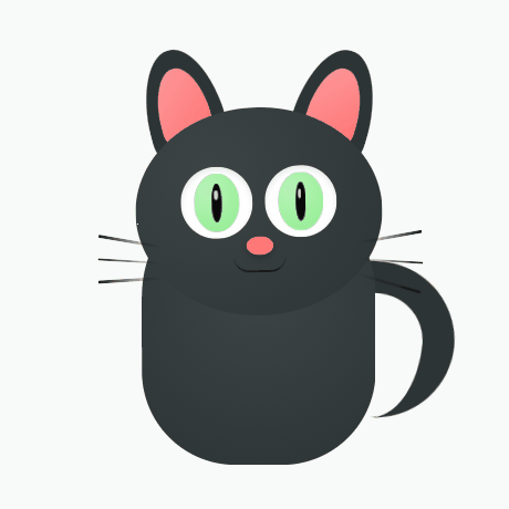 |
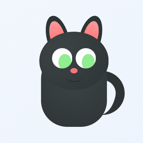 |
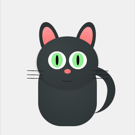 |
Clic droit "Enregistrer l'image sous..."
Le code HTML / CSS du Chat
<style>
    :root {
        --cat-dark: #2d3436;
        --cat-light: #3d4446;
        --pink: #ff7675;
        --eye-green: #90ee90;
    }

    .cat-wrapper {
        background: #f0f0f0; display: flex; justify-content: center; align-items: center;
        min-height: 450px; margin: 20px 0; overflow: hidden; border-radius: 15px;
        position: relative;
    }

    .cat-container {
        position: relative; width: 350px; height: 400px;
        transform: scale(0.85) translateZ(0); -webkit-transform: scale(0.85) translateZ(0);
    }

    .headcat {
        position: absolute; top: 85px; left: 50%; transform: translateX(-50%);
        width: 190px; height: 160px; background: radial-gradient(circle at 30% 30%, var(--cat-light), var(--cat-dark));
        border-radius: 50%; z-index: 5;
    }

    /* YEUX - Animation par opacité + scale pour Android */
    .eye {
        position: absolute; top: 45px; width: 55px; height: 55px;
        background: white; border-radius: 50%; overflow: hidden;
        animation: blink-android 5s infinite;
        -webkit-animation: blink-android 5s infinite;
    }
    .eye.left { left: 35px; }
    .eye.right { right: 35px; }

    @keyframes blink-android {
        0%, 20%, 80%, 100% { transform: scaleY(1); opacity: 1; }
        35%, 65% { transform: scaleY(0.1); opacity: 1; }
    }
    /* Doublure Webkit pour Chrome Android */
    @-webkit-keyframes blink-android {
        0%, 20%, 80%, 100% { -webkit-transform: scaleY(1); }
        35%, 65% { -webkit-transform: scaleY(0.1); }
    }

	/* --- BOUCHE & LANGUE --- */
	.mouth-container {
    position: absolute;
    top: 125px; /* On descend tout le bloc de la bouche */
    left: 50%;
    transform: translateX(-50%);
    width: 60px;
    height: 50px;
    z-index: 6;
    overflow: hidden;
	}

	.mouth {
    position: relative;
    width: 40px;
    height: 12px;
    margin: 0 auto;
    border-bottom: 2px solid #1a1a1a;
    border-radius: 0 0 20px 20px;
    z-index: 2;
	}

	.tongue {
    position: absolute;
    top: 0;
    left: 50%;
    width: 18px;
    height: 24px;
    background: var(--pink);
    border-radius: 0 0 10px 10px;
    z-index: 1;
    /* On la cache encore plus haut au repos */
    transform: translateX(-50%) translateY(-40px);
    -webkit-transform: translateX(-50%) translateY(-40px);
    opacity: 0;
    animation: tongue-android 5s infinite;
    -webkit-animation: tongue-android 5s infinite;
	}

	@keyframes tongue-android {
    0%, 42%, 68%, 100% {
        transform: translateX(-50%) translateY(-40px);
        opacity: 0;
    }
    50%, 60% {
        /* On la fait descendre de 15px au lieu de 10px */
        transform: translateX(-50%) translateY(15px);
        opacity: 1;
    }
	}

	@-webkit-keyframes tongue-android {
    0%, 42%, 68%, 100% {
        -webkit-transform: translateX(-50%) translateY(-40px);
        opacity: 0;
    }
    50%, 60% {
        -webkit-transform: translateX(-50%) translateY(15px);
        opacity: 1;
    }
	}

    /* RESTE DU CORPS */
    .iris { width: 35px; height: 45px; background: var(--eye-green); border-radius: 50%; margin: 5px auto; display: flex; justify-content: center; align-items: center; }
    .pupil { width: 8px; height: 30px; background: #000; border-radius: 50%; }
    .nose { position: absolute; top: 100px; left: 50%; transform: translateX(-50%); width: 20px; height: 14px; background: var(--pink); border-radius: 50%; z-index: 10; }
    .ear { position: absolute; top: 40px; width: 60px; height: 80px; background: var(--cat-dark); border-radius: 50% 50% 10% 10% / 80% 80% 20% 20%; z-index: 1; }
    .ear.left { left: 85px; transform: rotate(-15deg); }
    .ear.right { right: 85px; transform: rotate(15deg); }
    .ear::after { content: ''; position: absolute; top: 15px; left: 10px; width: 40px; height: 55px; background: linear-gradient(to bottom, #ff9a9e, var(--pink)); border-radius: inherit; }
    .bodycat { position: absolute; bottom: 40px; left: 50%; transform: translateX(-50%); width: 180px; height: 220px; background: radial-gradient(circle at 50% 40%, var(--cat-light), var(--cat-dark)); border-radius: 100px 100px 80px 80px; }
    .tail { position: absolute; right: 30px; bottom: 80px; width: 100px; height: 120px; border: 25px solid var(--cat-dark); border-left: none; border-bottom: none; border-radius: 0 100px 100px 0; transform-origin: bottom left; animation: wag 3s infinite ease-in-out; }
    @keyframes wag { 0%, 100% { transform: rotate(0deg); } 50% { transform: rotate(10deg); } }
    .whisker-group { position: absolute; top: 105px; width: 60px; display: flex; flex-direction: column; gap: 10px; }
    .whisker-group.left { left: -40px; align-items: flex-end; }
    .whisker-group.right { right: -40px; align-items: flex-start; }
    .whisker { width: 50px; height: 2px; background: #1a1a1a; border-radius: 2px; transform-origin: right; animation: twitch 2s infinite; }
    @keyframes twitch { 0%, 100% { transform: rotate(0deg); } 50% { transform: rotate(5deg); } }
</style>
<div class="cat-wrapper">
<div class="cat-container">
<div class="ear left"></div>
<div class="ear right"></div>
<div class="tail"></div>
<div class="bodycat"></div>
<div class="headcat">
<div class="eye left"><div class="iris"><div class="pupil"></div></div></div>
<div class="eye right"><div class="iris"><div class="pupil"></div></div></div>
<div class="nose"></div>
<div class="mouth-container">
<div class="mouth"></div>
<div class="tongue"></div>
</div>
<div class="whisker-group left">
<div class="whisker" style="transform: rotate(10deg);"></div>
<div class="whisker"></div>
<div class="whisker" style="transform: rotate(-10deg);"></div>
</div>
<div class="whisker-group right">
<div class="whisker" style="transform: rotate(-10deg);"></div>
<div class="whisker"></div>
<div class="whisker" style="transform: rotate(10deg);"></div>
</div>
</div>
</div>
</div>

